Lean thinking dictates that we try to turn any “problem” (or need, however big, however vague) into an actionable problem that can be analyzed. All problems come down, one way or another, to SQDCM (Safety, Quality, Delivery, Cost, Morale). How can we identify a gap (between the way things are and the way we need or want them to be) that we can analyze?
Furthermore, as you know, we try to never jump to conclusions, to solutions. That understanding is quite widespread now in the Lean Community, in theory if not practice. What is less understood is that, not only do we not jump to solutions, we don’t even jump to the five whys. First, we try to size up the situation. Define the problem. Identify the “gap.” That’s all I’m going to try to do with this discussion – identify a gap, not go anywhere near prescribing a solution, and stopping shy of even doing the full causal analysis. We’ll content ourselves with merely identifying the factors that must define the gap. That’s all.
Most discussions of the U.S.A. healthcare problem focus on the famous factoid, “100,000 deaths caused by less-than-the-best health care” provision. We should note: (1) that data is ten years old so the situation is arguably worse today than it was then, and (2) the data was a very rough generalization – the actual data was “… between 44,000 and 98,000 deaths…”, a figure that is routinely rounded up to 100,000.
I am one who often argues against starting with the cost equation (the “C” of SQDCM). Quality is usually a much better lever to use to rally the troops. We all know that poor quality ultimately results in higher cost. We also know that shortsighted cost-cutting usually results in poor quality. A downward spiral.
In the case of U.S. healthcare, however, the problem that is uniquely America’s is cost. All the waste and operational problems that we – including us lean enthusiasts – love to highlight are shared roughly equally around the world. By “around the world” I am talking about ALL countries that would be even remotely comparable to the U.S. in terms of socio-economic structure, including Canada, Australia, New Zealand, the United Kingdom, Japan, Germany, northern Europe, and Taiwan. I have visited hospitals in most of those countries (and others) and, on the surface at latest, the amount of waste and problems at the operational level appear essentially the same.
Those countries mostly pay roughly 8% of their GNP on healthcare (Germany and some northern European countries are higher, a little above 10%). Americans pay over 16% and rising. That is, Americans pay double, a big difference. It is a difference that also sits there as an easily doable gap analysis.
In all the debate, have you seen anyone tackle the problem by even discussing this gap, much less really analyzing it? I have seen, in academic circles, reams of data parsing the overall healthcare costs of various countries, but nothing in the way of a simple gap analysis that might shed some light – just a little please – on the U.S. national debate.
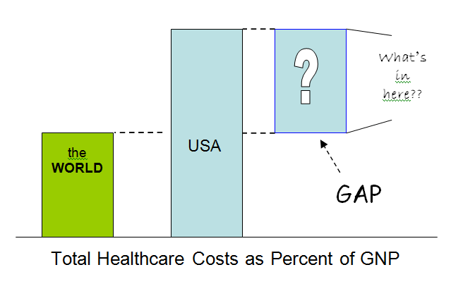
We lean folks take a certain kind of pleasure in pointing out the tremendous amount of waste and the poor quality that we can easily see in our hospitals. It is true that tremendous waste exists. But it would be simply incorrect to state that that waste is the cause of the U.S.A. healthcare crisis: All those other countries have the essentially same amount of visible waste in their hospitals! Walk through a hospital in Australia or Canada or Japan. The same typical problems exist. Errors, long lengths of stay, unnecessary admissions. Exactly the same. Indistinguishable.
But, they pay half as much. Each of those countries pays half as much, for better overall outcomes. And with the same (roughly) amounts of “waste” in their operational systems.
There is something seriously broken in our health system at the macro level. I’ve read a good bit about this topic, it is at the core of the national healthcare debate, yet all we hear are people screaming on both sides with no one talking about the problem. Or, not, at least, talking about this Gap.
The U.S. is the single outlier. So there must be something quite specific going on. Many people have their “pet” special cause. Some love to point to doctor pay. Others to exorbitant insurance cost due to frivolous lawsuits. Let’s say for our purposes here that there is at least SOME validity to all those pet causes. But, let’s also take a closer look and not pass judgment (yet) on the relative value of the various causes.
Certainly the causes of the Gap must be many and complex. But, surely we can identify a few buckets of cost, categories of activities where the costs lie. I am no expert in health care cost so am not the most qualified person to take on the analysis with the seriousness it deserves. But, here are my five buckets of cost that account for the Gap. I will try to be non-denominational – there will be much disagreement on the relative contributions of the buckets, but the idea I’m putting forth here is that the buckets together should account for essentially 100% of the cost gap. (Or, conversely, it is absolutely true that 100% of the Gap can be broken down into identifiable units of cost. Those units can surely be grouped – or “bucketed” – for analysis purposes. This is the way Lean Thinkers try to approach any problem. If it’s a cost problem, before we discuss solutions we ask: “What are the contributors of cost?”)
The U.S. Versus the World Healthcare Cost Gap:
- Inappropriate care. Some would argue that this should be a sub-category of the medical malpractice problem (below), since many inappropriate procedures are driven by fear of lawsuit. No doubt this explains the reason for a number of inappropriate procedures, but not all. I suggest three primary reasons for the great amount of inappropriate procedures conducted in the U.S.A:
- Misuse of emergency facilities. (This is the favorite of the left-wingers. Don’t worry, you right-wingers get your turn below.)
- Defensive medicine. (This is the favorite rationale of the right-wingers.)
- Profit. (Surely some doctors sometimes prescribe and perform procedures that make a lot of money because they make a lot of money.)
(By the way, Lean Enthusiasts – Which of the Seven Types of Waste is “inappropriateness?”)
- Medical malpractice lawsuits, with all its associated costs.
- Large population of uninsured. (Their care does get paid for eventually, somehow by somebody, and surely not in the most optimum way.)
- U.S. consumers pay more for research & development of new medical technologies and pharmaceuticals. (Most new technologies come from the U.S., and Americans pay for a disproportionate share of its development, through higher prices for the products once they reach market.)
- A convoluted system of middle agents in the form of health management organizations and insurance companies. It only takes two to health care — a provider and a patient. All the rest is muda, of either Type I or Type II (or, as Toyota calls it, Value-Creating Work and Non-Value Creating Work).
You know, it could be that the content of the extra 8% is just that the US has more of everything, in roughly equally amounts. Just general, overall excess. Could be. It could also be that the US population is just unhealthier. There’s a sixth bucket: unhealthy population. So all we need is free access to a local gym and membership to Jenny Craig.
To switch gears just a bit, last week we had a great discussion about some of these issues on the University of Michigan campus. John Campbell, professor emeritus of political science and my long-time mentor on all things Japanese, joined journalist T.R. Reid, author of the current NY Times bestseller, The Healing of America: A Global Quest for Better, Cheaper, and Fairer Health Care for a fascinating talk about national healthcare systems.
Prof. Campbell co-authored a book with Dr. Naoki Ikegami, Japan’s top health system economist (and who appears in Reid’s PBS documentary) which you must read if you are interested in a fascinating detailed look into healthcare in Japan, “The Art and Balance of Health Care Policy: Maintaining Japan’s Low-cost, Egalitarian System” from Cambridge University Press (1998). Interestingly, the book was a best seller in Japan ten years ago yet went totally unnoticed elsewhere. I recommend it highly – it is still remarkably relevant to the national debate and efforts to reform U.S. healthcare financing and delivery systems. The highlights:
- Japan pays half what the U.S. pays.
- Japan has the highest life expectancy in the world.
- Japan has the lowest infant mortality in the world.
- Japan has universal coverage which is extraordinarily egalitarian.
Yes, as many will quickly point out, Japan’s population is very different from that of the U.S.A. But, as T. R. Reid has found, the variance isn’t just between the U.S. and Japan, it’s between the U.S. and the rest of the entire developed world.
I am identifying the U.S.A. healthcare crisis as one of cost. I’m not sure of the solutions, or even the ultimate causes. I also know that, even aside from the cost problem, there is MUCH to be done – U.S. healthcare is a broken system on many levels and there is much lean work to be done to improve the situation. But, the U.S. national healthcare crisis is a crisis of cost. As percent of GNP, costs will pass 20% in no time at all. The cost versus revenue lines are converging, just as I saw them converging in the auto industry beginning many years ago. It will crash just as the financial system crashed last year. And THAT is the GAP that can be identified by comparing the U.S. national healthcare system to that of other countries.
Below, I attach some very interesting data for your reference. Rather than the familiar WHO statistics, this is from the OECD. The data seem to do a good job of showing apples compared to apples, healthcare dollar to health care yen or pound or Euro. (The real story to the data (besides the obvious which is seeing how ridiculous the U.S. looks overall) is the fact that the U.S.A. started from a high base (back in the 60s) AND has had a high growth rate. All the other countries EITHER started at a lower base rate OR started high like the U.S. but found ways to slow the growth. All the U.S. can hope to do now is seek ways to start to slow the growth.) You can see that clearly from the first chart, created by Mark Graban.
Note that ALL of the data below and the Cost Gap Analysis above represent only the first two sections of an A3. Not only do Lean Thinkers avoid jumping to a conclusion, for complex problems like this we don’t even jump to five-why analysis of the root cause until AFTER we have broken the problem down so we can see it. In this case, the Gap is so clear in cost terms, that it begs a thorough A3 style analysis. I’ll stop at this point. I hope some of the lean healthcare specialists among you will pick it up from here!
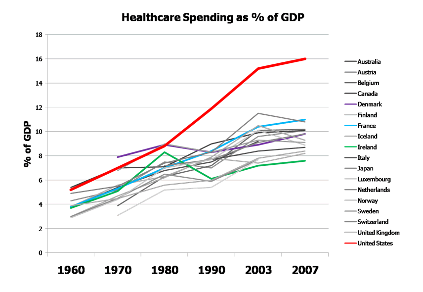
The following information is from the Organization for Economic Co-operation and Development (OECD) comparing the level and growth rate of health care spending in the United States with other OECD countries. The data I show here are a couple of years old – you can find up-to-date data yourself on the OECD website.
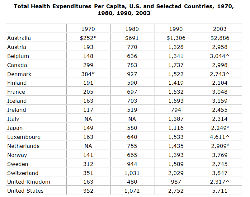
* Value shown is for 1971.
^ Break in series.
e OECD estimate.
NA: Not available.
Notes: Amounts in U.S. $ PPP. Germany is not included on this table because its data are not comparable over the time period due to reunification.
Source: Organisation for Economic Co-operation and Development. OECD Health Data 2006, from the OECD Internet subscription database updated October 10, 2006. Copyright OECD 2006, http://www.oecd.org/els/health-systems/health-data.htm.
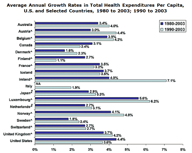
^ Break in series: Austria, 1995; Belgium, 2003; Denmark, 2003; Finland, 1993; France, 2002; Ireland, 1990; Japan, 1995; Luxembourg, 2003; Netherlands, 1998; Norway, 1997; Sweden, 1993; Switzerland, 1995; United Kingdom, 1997, 2003.
e OECD estimates: Japan, 2003; Netherlands, 2003.
NA: Not available.
Notes: Growth rates reflect average annual change in health expenditures per capita, in national currency units adjusted to year 2000 GDP price levels. Germany is not included on this table because its data are not comparable over the time period due to reunification.
Source: Organisation for Economic Co-operation and Development. OECD Health Data 2006, from the OECD Internet subscription database updated October 10, 2006. Copyright OECD 2006, http://www.oecd.org/els/health-systems/health-data.htm.
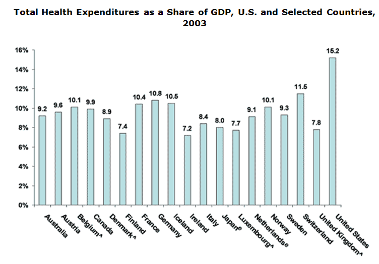
^ Break in series.
e OECD estimate.
Source: Organisation for Economic Co-operation and Development. OECD Health Data 2006, from the OECD Internet subscription database updated October 10, 2006. Copyright OECD 2006, http://www.oecd.org/els/health-systems/health-data.htm
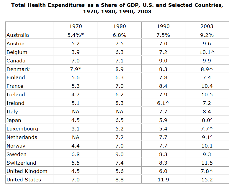
* Value shown is for 1971.
^ Break in series.
e OECD estimate.
NA: Not available.
Notes: Germany is not included on this table because its data are not comparable over the time period due to reunification.
Source: Organisation for Economic Co-operation and Development. OECD Health Data 2006, from the OECD Internet subscription database updated October 10, 2006. Copyright OECD 2006, http://www.oecd.org/els/health-systems/health-data.htm.
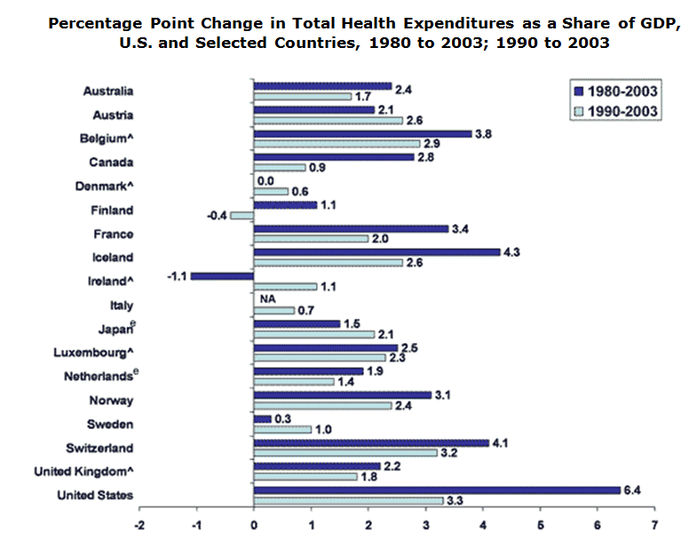
^ Break in series: Belgium, 2003; Denmark, 2003; Ireland, 1990; Luxembourg, 2003; United Kingdom, 2003.
e OECD estimates: Japan, 2003; Netherlands, 2003.
NA: Not available.
Notes: Germany is not included on this table because its data are not comparable over the time period due to reunification.
Source: Organisation for Economic Co-operation and Development. OECD Health Data 2006, from the OECD Internet subscription database updated October 10, 2006. Copyright OECD 2006, http://www.oecd.org/els/health-systems/health-data.htm.


